Headless UI v2.0 for React
- Date
 Adam Wathan
 Jonathan Reinink

Nothing beats actually building something real with your own tools when it comes to finding ways to make things better.
As we’ve been working on Catalyst these last several months, we’ve been making dozens of improvements to Headless UI that let you write even less code, and make the developer experience even better.
We just released Headless UI v2.0 for React, which is the culmination of all this work.
Here’s all the best new stuff:
- Built-in anchor positioning
- New checkbox component
- HTML form components
- Improved hover, focus and active state detection
- Combobox list virtualization
- New website and improved docs
Add it to your project by installing the latest version of @headlessui/react from npm:
npm install @headlessui/react@latestIf you’re upgrading from v1.x, check out the upgrade guide to learn more about what’s changed.
Built-in anchor positioning
We’ve integrated Floating UI directly into Headless UI, so you never have to worry about dropdowns going out of view or being obscured by other elements on the screen.
Use the new anchor prop on the Menu, Popover, Combobox, and Listbox components to specify the anchor positioning, then fine-tune the placement with CSS variables like --anchor-gap and --anchor-padding:
Scroll up and down to see the dropdown position change
import { Menu, MenuButton, MenuItem, MenuItems } from '@headlessui/react'

function Example() {
  return (
      <Menu>
        <MenuButton>Options</MenuButton>
        <MenuItems
          anchor="bottom start"
          className="[--anchor-gap:8px] [--anchor-padding:8px]"
        >
          <MenuItem>
            <button>Edit</button>
          </MenuItem>
          <MenuItem>
            <button>Duplicate</button>
          </MenuItem>
          <hr />
          <MenuItem>
            <button>Archive</button>
          </MenuItem>
          <MenuItem>
            <button>Delete</button>
          </MenuItem>
        </MenuItems>
      </Menu>
  )
}
What makes this API really nice is that you can tweak the styles at different breakpoints by changing the CSS variables using utility classes like sm:[--anchor-gap:4px].
Check out the anchor positioning documentation for each component for all of the details.
New checkbox component
We’ve added a new headless Checkbox component to complement our existing RadioGroup component, making it easy to build totally custom checkbox controls:
This will give you early access to any awesome new features we're developing.
import { Checkbox, Description, Field, Label } from '@headlessui/react'
import { CheckmarkIcon } from './icons/checkmark'
import clsx from 'clsx'

function Example() {
  return (
    <Field>
      <Checkbox
        defaultChecked
        className={clsx(
          'size-4 rounded border bg-white dark:bg-white/5',
          'data-[checked]:border-transparent data-[checked]:bg-blue-500',
          'focus:outline-none data-[focus]:outline-2 data-[focus]:outline-offset-2 data-[focus]:outline-blue-500',
        )}
      >
        <CheckmarkIcon className="stroke-white opacity-0 group-data-[checked]:opacity-100" />
      </Checkbox>
      <div>
        <Label>Enable beta features</Label>
        <Description>
          This will give you early access to any awesome new features we're developing.
        </Description>
      </div>
    </Field>
  )
}
Checkboxes can be controlled or uncontrolled, and can automatically sync their state with a hidden input to play nicely with HTML forms.
Take a look at the Checkbox documentation to learn more.
HTML form components
We’ve added a whole new set of components that just wrap native form controls, but do all of the tedious work of wiring up IDs and aria-* attributes for you automatically.
Here’s what it looked like to build a simple <input> field with a properly associated <label> and description before:
<div>
  <label id="name-label" for="name-input">Name</label>
  <input
    id="name-input"
    aria-labelledby="name-label"
    aria-describedby="name-description"
  />
  <p id="name-description">Use your real name so people will recognize you.</p>
</div>
And here’s what it looks like with these new components in Headless UI v2.0:
import { Description, Field, Input, Label } from '@headlessui/react'

function Example() {
  return (
    <Field>
      <Label>Name</Label>
      <Input name="your_name" />
      <Description>Use your real name so people will recognize you.</Description>
    </Field>
  )
}
The new Field and Fieldset components also cascade disabled states like the native <fieldset> element, so you can easily disable an entire group of controls at once:
Select a country to see the region field become enabled
We currently only ship to North America.
import { Button, Description, Field, Fieldset, Input, Label, Legend, Select } from '@headlessui/react'
import { regions } from './countries'

export function Example() {
  const [country, setCountry] = useState(null)

  return (
    <form action="/shipping">
      <Fieldset>
        <Legend>Shipping details</Legend>
        <Field>
          <Label>Street address</Label>
          <Input name="address" />
        </Field>
        <Field>
          <Label>Country</Label>
          <Description>We currently only ship to North America.</Description>
          <Select
            name="country"
            value={country}
            onChange={(event) => setCountry(event.target.value)}
          >
            <option></option>
            <option>Canada</option>
            <option>Mexico</option>
            <option>United States</option>
          </Select>
        </Field>
        <Field disabled={!country}>
          <Label className="data-[disabled]:opacity-40">State/province</Label>
          <Select name="region" className="data-[disabled]:opacity-50">
            <option></option>
            {country && regions[country].map((region) => <option>{region}</option>)}
          </Select>
        </Field>
        <Button>Submit</Button>
      </Fieldset>
    </form>
  )
}
We expose the disabled state using a data-disabled attribute in the rendered HTML. This lets us expose it even on elements that don’t support the native disabled attribute like the associated <label> element, making it really easy to fine-tune the disabled styles for each element.
All in all we’ve added 8 new components here — Fieldset, Legend, Field, Label, Description, Input, Select, and Textarea.
For more details, start with the Fieldset documentation and work your way through the rest.
Improved hover, focus and active state detection
Using hooks from the awesome React Aria library under the hood, Headless UI now adds smarter data-* state attributes to your controls that behave more consistently across different devices than the native CSS pseudo-classes:
data-active— like:active, but is removed when dragging off of the element.data-hover— like:hover, but is ignored on touch devices to avoid sticky hover states.data-focus— like:focus-visible, without false positives from imperative focusing.
Click, hover, focus, and drag the button to see the data attributes applied
<!-- Rendered `Button` -->
<button data-active data-hover data-focus class="bg-indigo-600 data-[active]:bg-indigo-700 data-[hover]:bg-indigo-500 data-[focus]:outline ...">
  Submit
</button>
To learn more about why applying these styles using JavaScript is important, I highly recommend reading through Devon Govett’s excellent blog series on this topic:
- Building a Button Part 1: Press Events
- Building a Button Part 2: Hover Interactions
- Building a Button Part 3: Keyboard Focus Behavior
The web never ceases to surprise me with the amount of effort it takes to actually make nice things.
Combobox list virtualization
We’ve integrated TanStack Virtual into Headless UI to support list virtualization when you need to put a hundred thousand items in your combobox because, hey, that’s what the boss told you to do.
Use the new virtual prop to pass in all of your items, and use the ComboboxOptions render prop to provide the template for an individual option:
Open the combobox and scroll through the 1,000 options
import { Combobox, ComboboxButton, ComboboxInput, ComboboxOption, ComboboxOptions } from '@headlessui/react'
import { ChevronDownIcon } from '@heroicons/react/20/solid'
import { useState } from 'react'

const people = [
  { id: 1, name: 'Rossie Abernathy' },
  { id: 2, name: 'Juana Abshire' },
  { id: 3, name: 'Leonel Abshire' },
  { id: 4, name: 'Llewellyn Abshire' },
  { id: 5, name: 'Ramon Abshire' },
  // ...up to 1000 people
]

function Example() {
  const [query, setQuery] = useState('')
  const [selected, setSelected] = useState(people[0])

  const filteredPeople =
    query === ''
      ? people
      : people.filter((person) => {
          return person.name.toLowerCase().includes(query.toLowerCase())
        })

  return (
    <Combobox
      value={selected}
      virtual={{ options: filteredPeople }}
      onChange={(value) => setSelected(value)}
      onClose={() => setQuery('')}
    >
      <div>
        <ComboboxInput
          displayValue={(person) => person?.name}
          onChange={(event) => setQuery(event.target.value)}
        />
        <ComboboxButton>
          <ChevronDownIcon />
        </ComboboxButton>
      </div>
      <ComboboxOptions>
        {({ option: person }) => (
          <ComboboxOption key={person.id} value={person}>
            {person.name}
          </ComboboxOption>
        )}
      </ComboboxOptions>
    </Combobox>
  )
}
Check out the new virtual scrolling documentation to learn more.
New website and improved docs
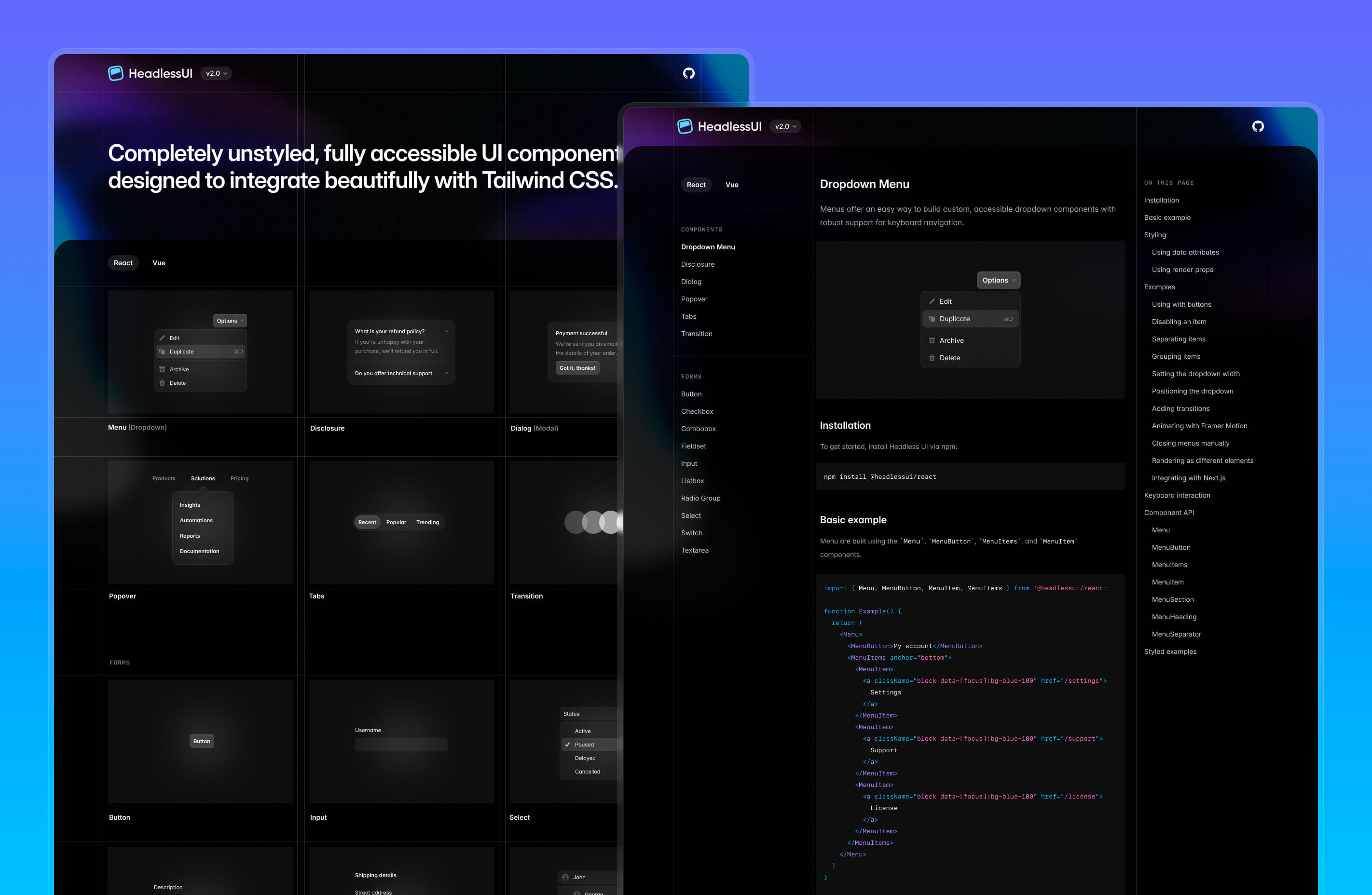
To go along with this major release, we’ve also significantly revamped the documentation and given the website a fresh coat of paint:

Head over to the new headlessui.com to check it out!

